A Short Introduction to Figma
- Written by
- Timo Frühwirth
- Published on
- April 11, 2022
- Tagged with
- UI design
Learning Objectives
- Readers can sign up to Figma and create teams
- Readers can create mock-ups of UIs (user interfaces) in Figma
- Readers can prototype UI functionality in Figma, including links and simple dropdown lists
Introduction
Figma is a tool for collaborative UI design. It can be used both for interface mock-up (realistic visual design) and prototyping (realistic visual design plus simulation of interface functionalitites). Please note that mock-up and prototyping will usually not be the first steps in UI design: other steps in the requirement analysis (such as expert interviews, brainstorming, or use case modeling) will commonly pave the way for creating specific designs. Most especially, mock-up and prototyping are typically immediately preceded by pen-and-paper wireframing.
From the digital humanist’s perspective, key advantages of using Figma include its potential for creating visually realistic interface designs that can give the members of a DH project a precise idea of the UI to be developed. That can help to make a project team’s decision-making in relation to web design more efficient. Furthermore, Figma allows to collaboratively design UIs without requiring any coding skills, thereby empowering project members who have little or no prior knowledge of web development.
This chapter will introduce you to Figma by offering a step-by-step guideline for creating a UI for an example project (a fictional digital edition titled “Awesome Poetry”). After completing the tutorial, you will be able to use the most common functions of Figma and know how to start designing your own project’s interface. We recommend signing up for Figma and trying out the individual steps while working through these guidelines.
First Steps
Sign Up
Figma can be used through a web-based application. There are different pricing options including a free Starter plan with limited numbers of files, as well as Professional (free for students and educators) and Organization plans (April 2022).
Create a Team
Create a team to collaborate. Right at the start, Figma will ask you to name your team and invite your collaborators. Choose the Starter team plan for trying Figma. You can work in Figma individually as well. If you skip creating a team for now, you can later select + Create new team in the bottom-left part of the Figma start screen.
In our example project, the team’s name is “Awesome Poetry” (next to the blue square on the left).
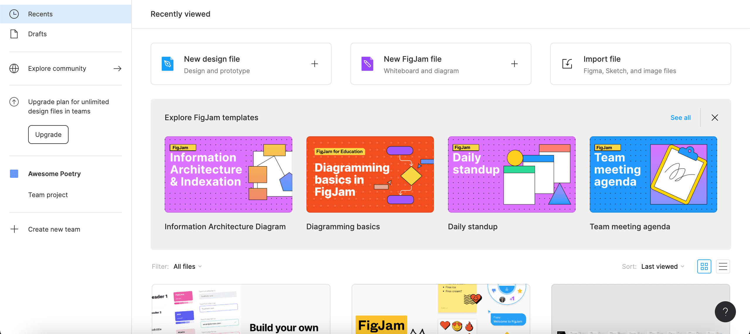
Figure 1: The Figma start screen.
Mock-Up
Create a Design File
To design a mock-up for our example project, create a new design file by clicking New design file (or by clicking the + icon that will appear next to Team project when you hover over it and selecting Design file). That will open the Figma workspace screen.
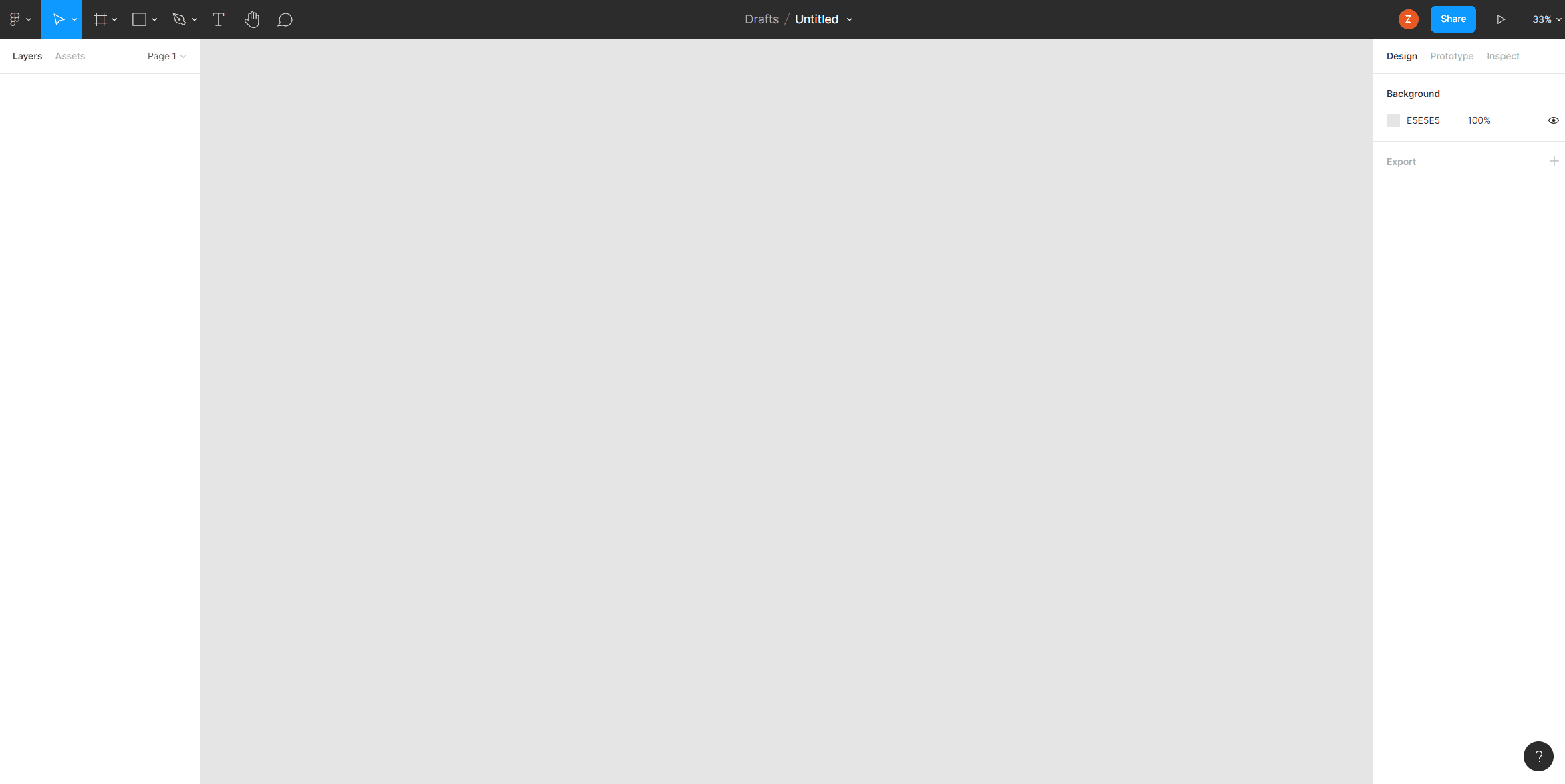
Figure 2: The Figma workspace screen.
Take a moment to orient yourself. There is a dark gray tool bar in the top of the screen with several icons on the left and the file name in the middle (still “Untitled”); a Layers area on the left-hand side (still empty) will list the elements used in your mock-up/prototype; a Design area on the right-hand side will show you options to design those elements; the main window (gray) is where you will create the mock-up/prototye. Click on the file name and rename the file “ap_mockup”.
The first step is to create a frame to represent the start page of your future website. When you click on the Frame icon (the third icon from left in the tool bar, the default choice of the Region tools dropdown list), the right-hand Design area will offer predefined sizes of frames that correspond to different devices for accessing websites. For our digital edition of awesome poetry, select Desktop size (1440 x 1024 px). In the left-hand Layers area, double-click the name of the frame (“Desktop - 1” or so) and rename it “StartPage”.
Create Sub-Frames
We can now add sub-frames within the “StartPage” top-frame to define large areas within that page. Let’s first create a navigation bar: select Frame and draw an oblong shape in the top part of your page. In the Layers area, rename it “NavBar”. The width and height are displayed in the right-hand Design area (and next to the frame when selected). Further below, in the Fill segment of the Design area, you can pick a color. In the example, a dark blue has been chosen. As that hue will be used as one of the edition UI’s signature colors, it can be saved: next to Fill, click on the four-dot icon which the tooltip will identify as Styles button. Then, select + and name the color style, say, “EditionBlue”. Now, you can easily come back to that color whenever you need it.
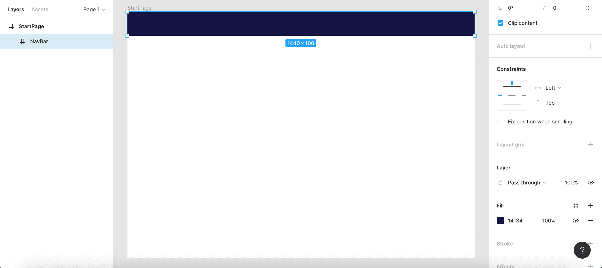
Figure 3: Adding a navigation bar to your start page.
Add three more sub-frames: a large frame below the “NavBar” as the “MainFrame”; a smaller “FunderFrame” below that; and, finally, a slim “ImprintFrame” on the bottom of your “StartPage”. Fill the “MainFrame” with an off-white color and save that color as “EditionWhite”. Give the “FunderFrame” a thin blue border: in the Stroke segment of the Design area, click the four-dot icon and select the “EditionBlue” hue to apply the color style that has been saved before; set the line width to “1”. Leave the “FunderFrame” white and make the “ImprintFrame” gray. In the left-hand Layers navigation, arrange the frames according to their position on the page.
Populate Frames with Objects
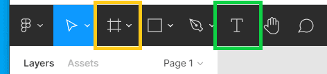
Figure 4: The tool bar of the Figma workspace screen.
You can now start adding objects to the frames. In the Shape tools dropdown list (the fourth drop-down button from left in the tool bar of the workspace screen, highlighted here in orange), pick Ellipse and, in the blue “NavBar” of your page, draw a circle as a logo placeholder. Color it in “EditionWhite” and rename it “APLogoShape”. Add some text onto it (such as “AP”) by selecting the Text icon (the sixth button from left, highlighed here in green). You can style that text via the Text section of the Design area: again, select the “EditionBlue” hue by clicking the four-dot icon next to Fill. Rename the text object “APLogoText”.
Furthermore, add a rectangular shape as well as some text to represent a drop-down button in the “NavBar”. Style and rename as “DropDownShape” and “DropDownText”, respectively.
Add three text objects to your “MainFrame”: a title, a subtitle, and some placeholder text, representing an introduction to your edition website. Also, add a rectangle and a text to stand for a search field. In the “FunderFrame”, add a shape and text to represent some funder’s logo. Moreover, add a text, representing a link, to your “ImprintFrame”. Style those objects and rename them in useful ways.
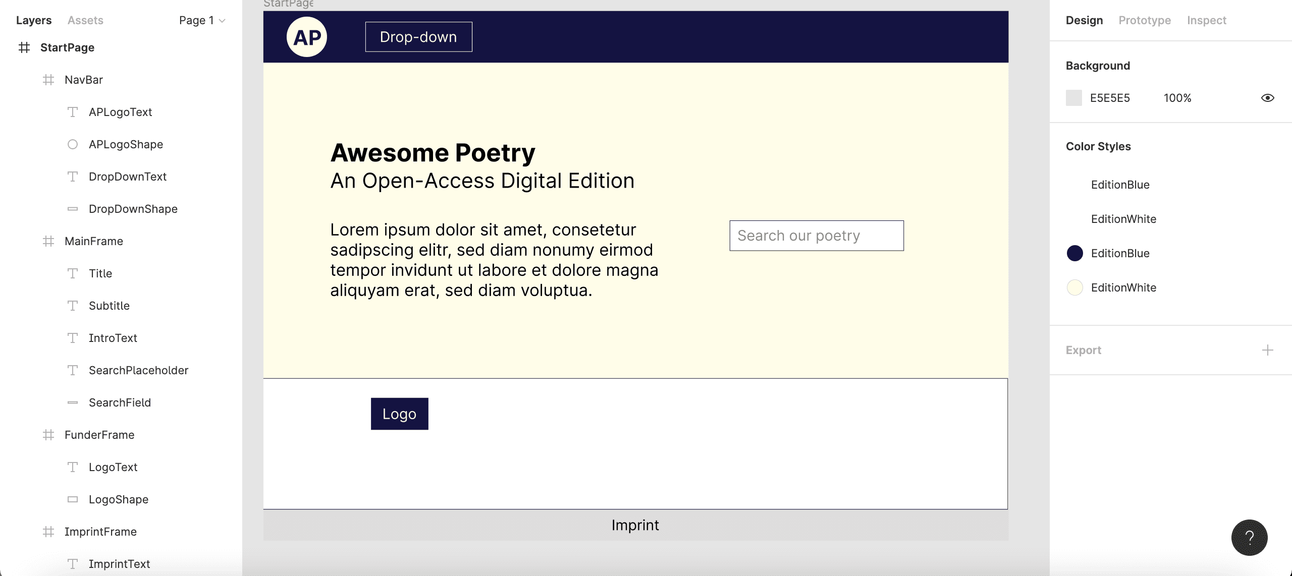
Figure 5: Shape and text objects populating your start page.
Group Objects Together
It is useful to group together objects that belong together: for example, objects which constitute a more complex single object. In the Layers area, select both “APLogoText” and “APLogoShape”, right-click them (or perform whatever action, on your device, corresponds to pressing the right-hand button on a mouse), and select Group selection. Groups are symbolized in the Layersarea through dashed-line rectangles: rename the so created group “APLogo”. Likewise, create “DropDown”, “StartPageText”, “SearchFunction”, and “Logo” groups. When you select those group names in the Layers area, you can target the whole complex objects (instead of just their parts). In order to overview the elements of your page, you might wish to collapse those layers in the Layers area which are below the group level.
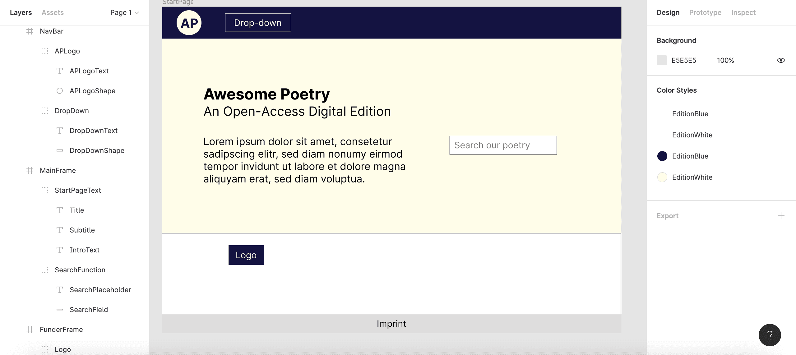
Figure 6: Objects in your start page being grouped together.
Create Components
If there are objects or groups that are used more than once, you can create components out of them for easy reuse. In the Layers area, right-click the “Logo” group (the placeholder funder logo) and select Create component. You can also click the Create component icon in the middle of the tool bar of the workspace screen. As a component, it is now highlighted in purple color.
Now, change the view in the left-hand window from Layers to Assets by clicking the Assets tab. In that tab, you will find the “Logo” component below the “StartPage” segment. From here, you can drag-and-drop that component multiple times onto the “FunderFrame” to represent several funder logos.
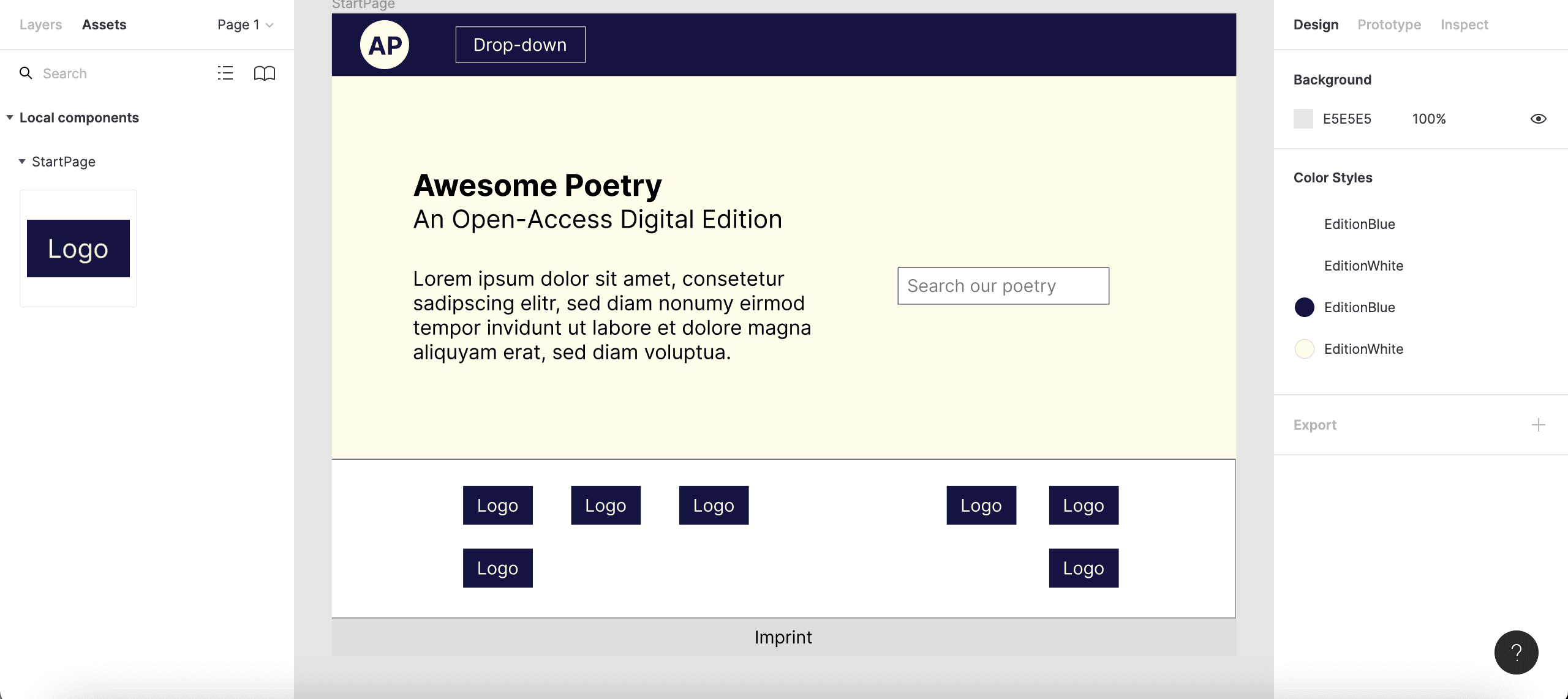
Figure 7: Instances of your “Logo” component in your start page’s funder area.
Preview
You have now created a simple mock-up for the start page of a digital-edition UI. By means of adding even more objects, groups, and components (to represent, for instance, images as well as further buttons and input fields), you can create visually realistic mock-ups of website pages. At this point, you might well wish to see your page in presentation mode (rather than work mode). For that, click the Present button (second button from right in the workspace tool bar). In the Options dropdown list, select Fit to screen to admire your “StartPage” in its entirety.
Prototyping
What is more, Figma lets you also prototype interface functionality by simulating user interactivity and linking.
An Easy Example: Create a Link to Another Page
Suppose that the “ImprintText” object on the bottom of your “StartPage” is meant to represent a link to another page containing information about the website’s publisher. So, let’s first build another page. Create a second desktop top-frame as you did above. It might be useful now to zoom out of the central window of the Figma workspace screen so that you can see both of your pages. Rename the new page to “ImprintPage”. (While we are leaving that new page blank, you will usually want to design it in a way that is similar to your “StartPage”. Among other things, you might well want to create a “NavBar” component and add it to the top of all of your pages.)
Turn the “ImprintText” object into a component as you did before with the logo placeholder (see instructions above in the “Create Components” section). This time, however, do not simply duplicate the component. Instead, drag-and-drop the “ImprintText” component from the “StartPage” frame into the gray area that surrounds it. That way, we can separate the orignal component, which we want to edit, from its instances. In the Layers area, the “ImprintText” component will no longer be shown within the “StartPage” hierarchy, but on the same level as both the “StartPage” and the “ImprintPage”.
We can now create two different variants of our “ImprintText” component that correspond to two different types of user interaction:
- “Default”: when there is no user interaction,
- “Hover”: when a user’s cursor hovers above the “ImprintText”.
Keep the “ImprintText” component selected. In the right-hand Design area, click on the + next to Properties and select Variant. This first variant will automatically be named “Default” - leave it like that. By clicking on the + (purple background) below the “ImprintText” component, you can now create a second variant. It is important that both variants are surrounded by the purple dashed line in order to be linked to the same component; sometimes you will have to enlarge that area to cover all variants. In the Design area, you can now rename that second variant from “Variant2” to “Hover”. (There has been a recent change in the Figma interface: before, you had to click into a Variants section, located in the Design area, and the component would automatically be duplicated. This is why what you can see on your own screen might slighty deviate from what is depicted in the screenshot below.)
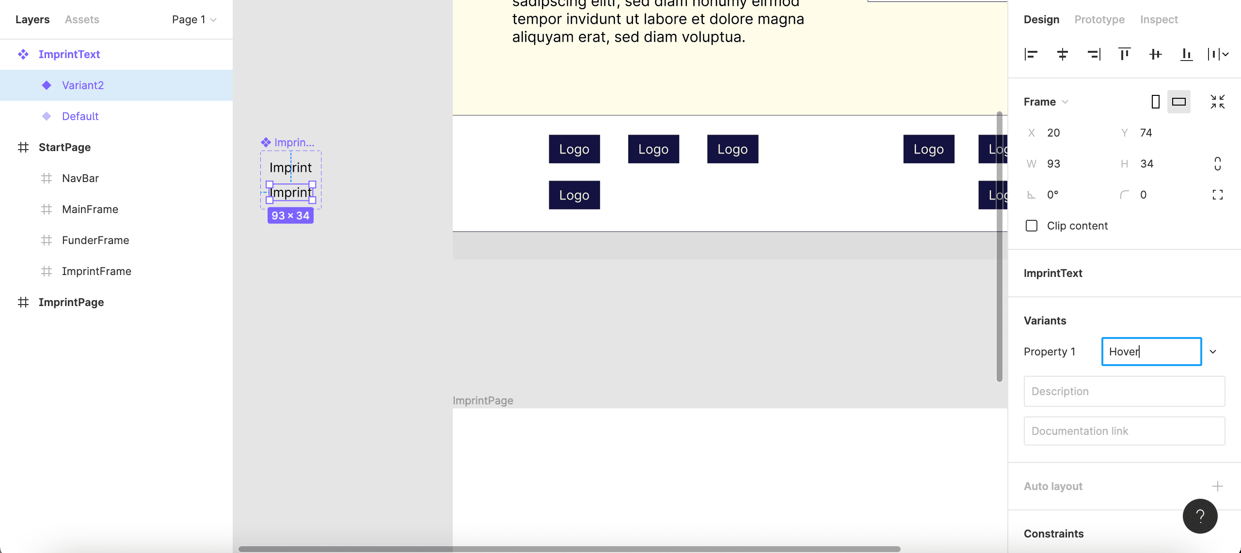
Figure 8: Renaming the second variant of your “ImprintText” component.
Now, we can design what it should look like when a cursor hovers over the “ImprintText”. Twice double-click on the lower variant to highlight the text and style it bold. You could also change the text color, or add a drop shadow in the Effects segment.
The next step is to define the interaction that triggers that “Hover” variant. To that end, select the (upper) “Default” variant. In the top of the right-hand control area, switch from the Design to the Prototype tab. Next to Interactions, click the +. In the Interaction details window that now pops up, choose While hovering - Change to - “Hover”. Close the window. As long as the Prototype tab is active, the “Default” variant is now visually connected to the “Hover” variant through a purple arrow, indicating that the former will change to the latter when an event (a hover event, in this case) takes place.
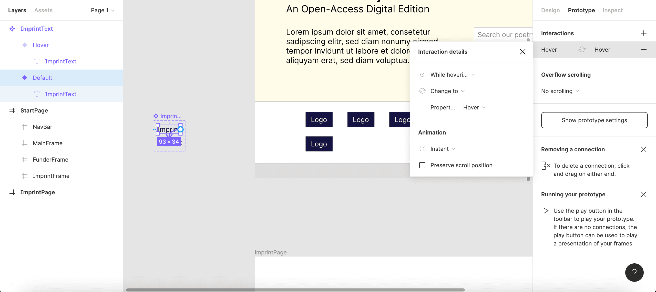
Figure 9: Interaction details of the “ImprintText” component.
However, we also want the “ImprintText” component to link to the “ImprintPage” when clicked. For this, highlight the lower (“Hover”) variant of the “ImprintText” component. In the Prototype section, click + and then select On click - Navigate to - “ImprintPage”. A blue arrow will now visualize the linking to the “ImprintPage”.
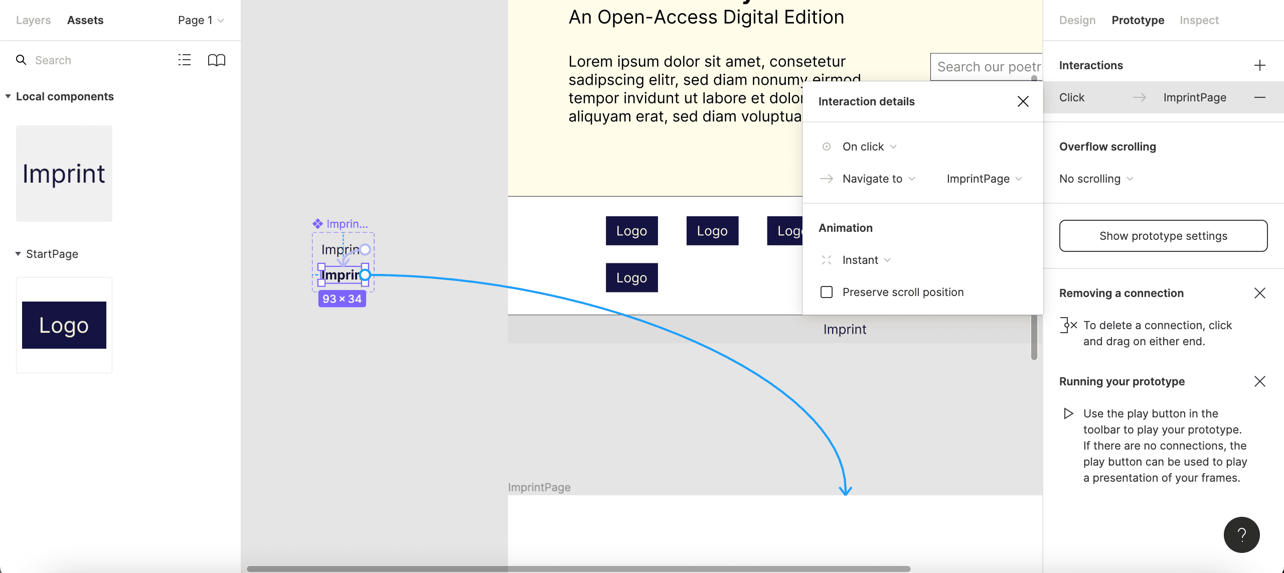
Figure 10: Interaction as well as navigation details.
The “ImprintText” component is now fully configured, and an instance of it can be implemented in the design of the “StartPage”. From the left-hand Assets area, beneath Local components, drag-and-drop the “ImprintText” component to the “ImprintFrame” of your “StartPage”. Switch to Present mode and try out the hover event and linking.
A More Complex Example: Create a Dropdown List
There is an empty dropdown button in your “NavBar” that we can now prototype as well. Proceed as before: create a component out of the “DropDown” group, and drag-and-drop it into the gray area outside your pages (leave more space around it than before). Create a “Hover” variant, which you can style by inverting its colors (“EditionBlue” text and border colors, “EditionWhite” fill color). Add an interaction that is triggered by a Hover event.
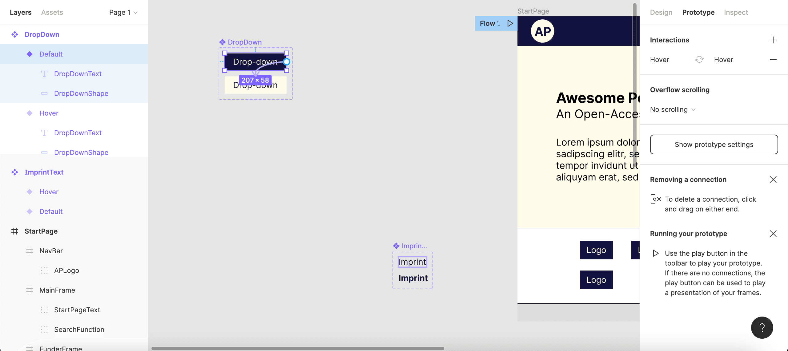
Figure 11: Interaction details for two variants of your “DropDown” component.
We can now design three distinct states of the dropdown list to represent three different types of user interaction once a user’s cursor hovers above the dropdown button:
- “Click”: when a user clicks on the button (the dropdown list opens, the button gets an “EditionBlue” fill color, the two options have an “EditionWhite” fill color),
- “Hover1”: when a user’s cursor hovers over the first option of the open dropdown list (the button and the first option are blue, the second option is white),
- “Hover2”: when a user’s cursor hovers over the second option (blue button and second option, white first option segment).
In the gray area of the central window, somewhere outside the purple dashed-line rectangle that marks the area of the “DropDown” component, design those three states. For this, you can copy-paste the “DropDownText” and “DropDownShape” objects from the “DropDown” component in the Layers area, and combine and style them to design the three states described above. All of these versions should have three segments: a button (“Drop-down”) and two fields representing links to other pages (say, “Somewhere” and “Nowhere”). Group the objects that belong together and rename the groups “DropDownOpen”, “DropDownOpenHover1”, and “DropDownOpenHover2”.
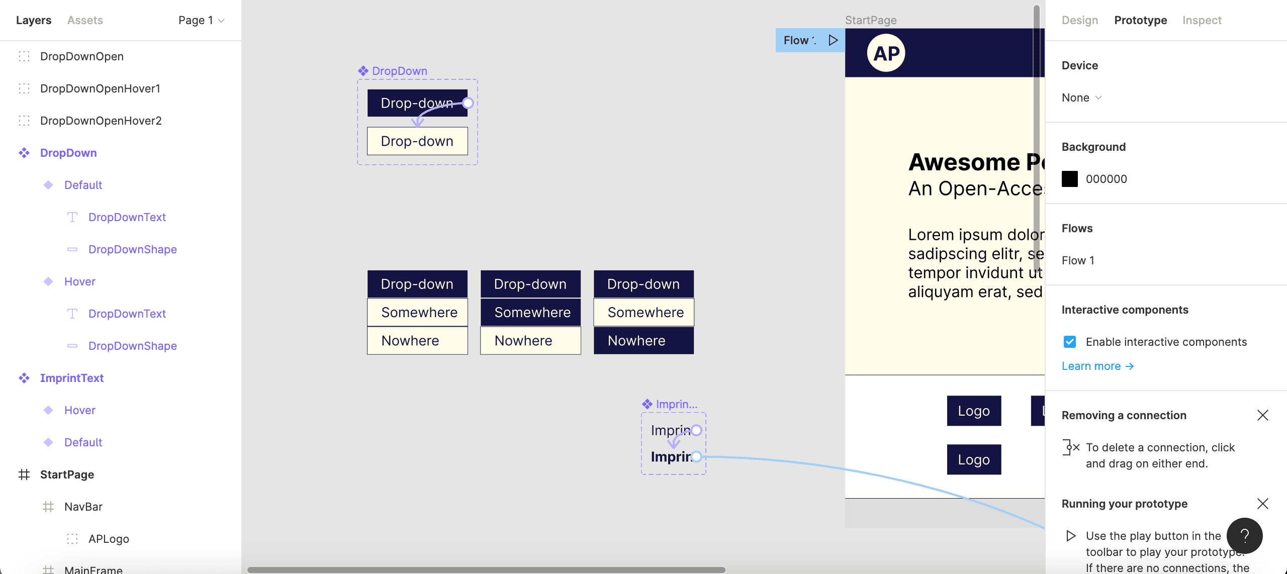
Figure 12: Creating groups to represent the different states of an opened dropdown list.
Now, those groups that represent the three different states of the opened dropdown list can be used as different variants of the “DropDown” component. To do that, first select the “Hover” variant of the “DropDown” component and click on the purple + icon that will appear next to it; rename “Variant3” to “Click”. Enlarge the purple dashed-line rectangle that delimits the component variants. In the left-hand Layers area, select and copy all objects of the “DropDownOpen” group.
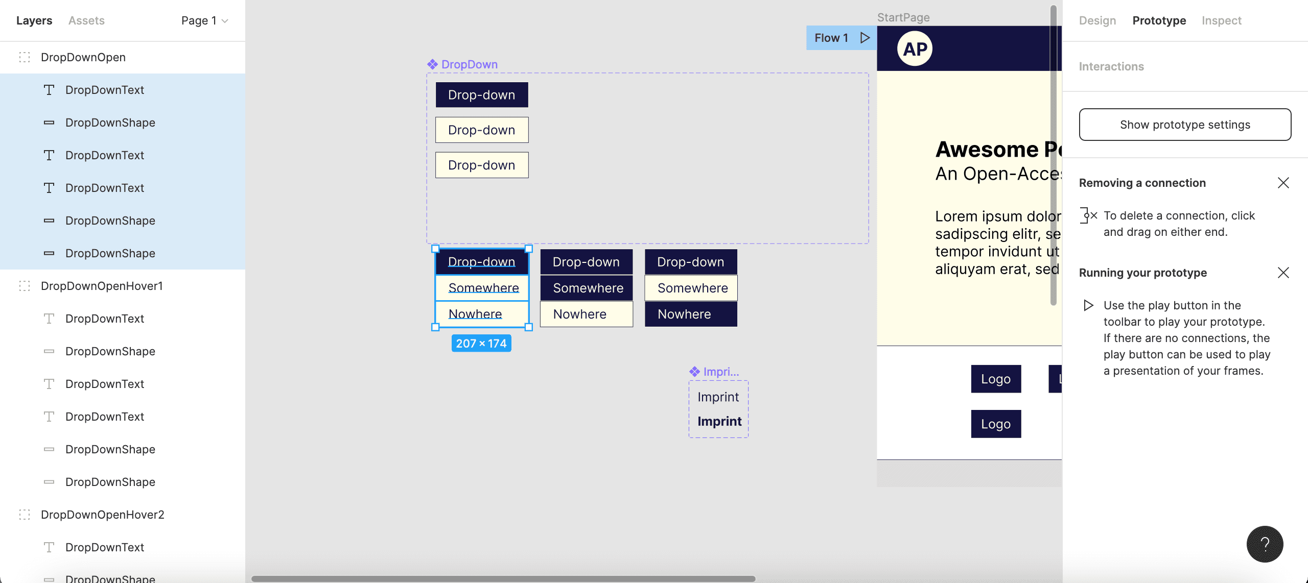
Figure 13: Copying the first group’s objects …
Further below in the Layers area, now, highlight the “Click” variant and paste the objects from the clipboard (use a keyboard shortcut to paste). The copied objects will now be shown in the Layers area as part of the “Click” variant. (You might also see here the “DropDownText” and “DropDownShape” of the original variant, which has been overwritten, being still around as part of the “Click” variant; you can delete them.)
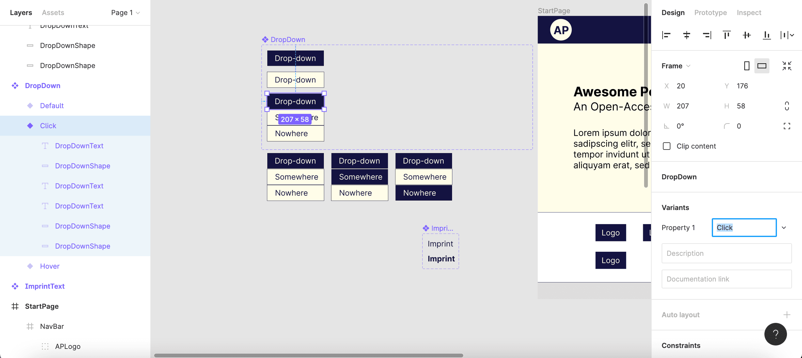
Figure 14: … and pasting them into the “Click” variant.
In the Prototype area, create an interaction that links the “Hover” variant to the “Click” variant (On click - Change to - “Click”).
Now, add two more variants, overwrite them with the two other groups designed below, and rename them “Hover1” and “Hover2”, respectively. In the Prototype area, create the following user interactions:
- when a user clicks on the “Drop-down” button of the “Click” variant, change back to the “Default” variant (
On click-Change to- “Default”), - when a user’s cursor hovers over the “Somewhere” field of the “Click” variant, change to the “Hover1” variant (
While hovering-Change to- “Hover1”), - when a user’s cursor hovers over the “Nowhere” field of the “Click” variant, change to “Hover2” (
While hovering-Change to- “Hover2”).
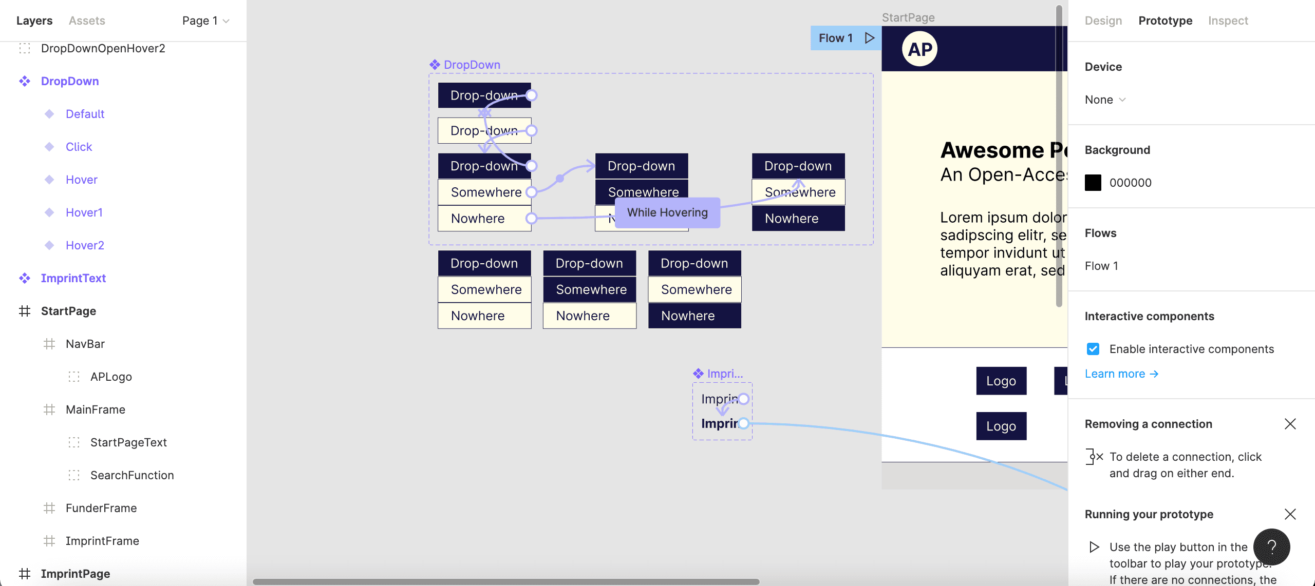
Figure 15: Interaction details for all five variants of your “DropDown” component.
Finally, create another page (“SomePage”) and make Figma navigate to it when a user clicks on the “Somewhere” field of the “Hover1” variant (On click- Navigate to - “SomePage”).
The “DropDown” component is now fairly well configured (fittingly, the “Nowhere” link links nowhere). From the Assets area, drag-and-drop it to the “NavBar” of your “StartPage”. However, it is necessary to move that instance of our “DropDown” component, in the Layers area, from the “NavBar” sub-frame up to the “StartPage” top-frame (as its appearance will otherwise be limited to the slim space of the “NavBar” sub-frame).
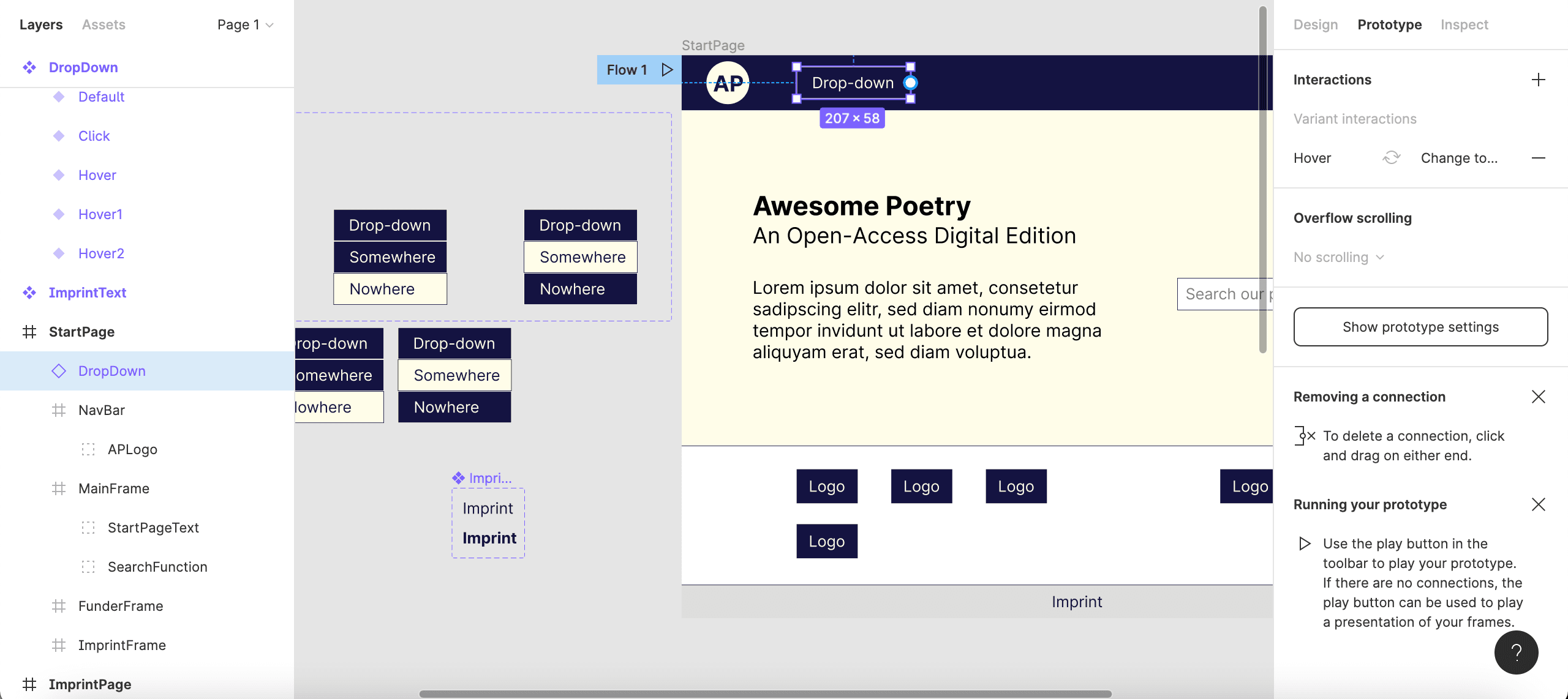
Figure 16: Inserting an instance of the “DropDown” component into your start page.
As long as the Prototype view is active, you will see a fairly complex network of interrelations between component variants (purple arrows) as well as links between variants and pages (blue arrows).
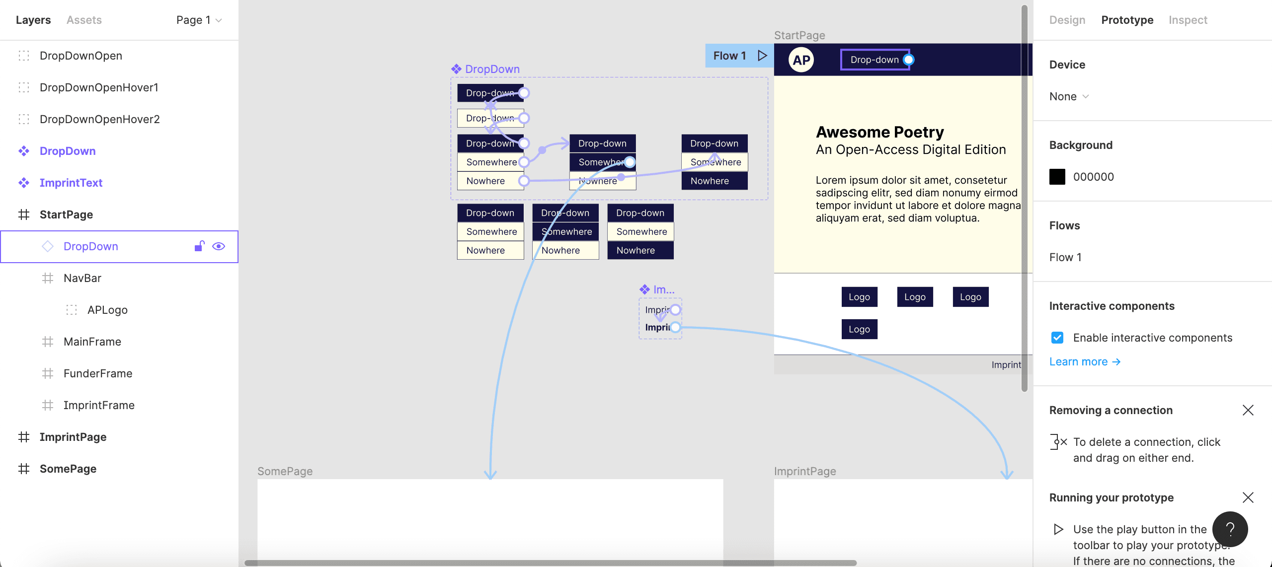
Figure 17: Full interaction and navigation details of the “DropDown” component.
In the presentation mode, try out the user interactivity added to your website prototype.
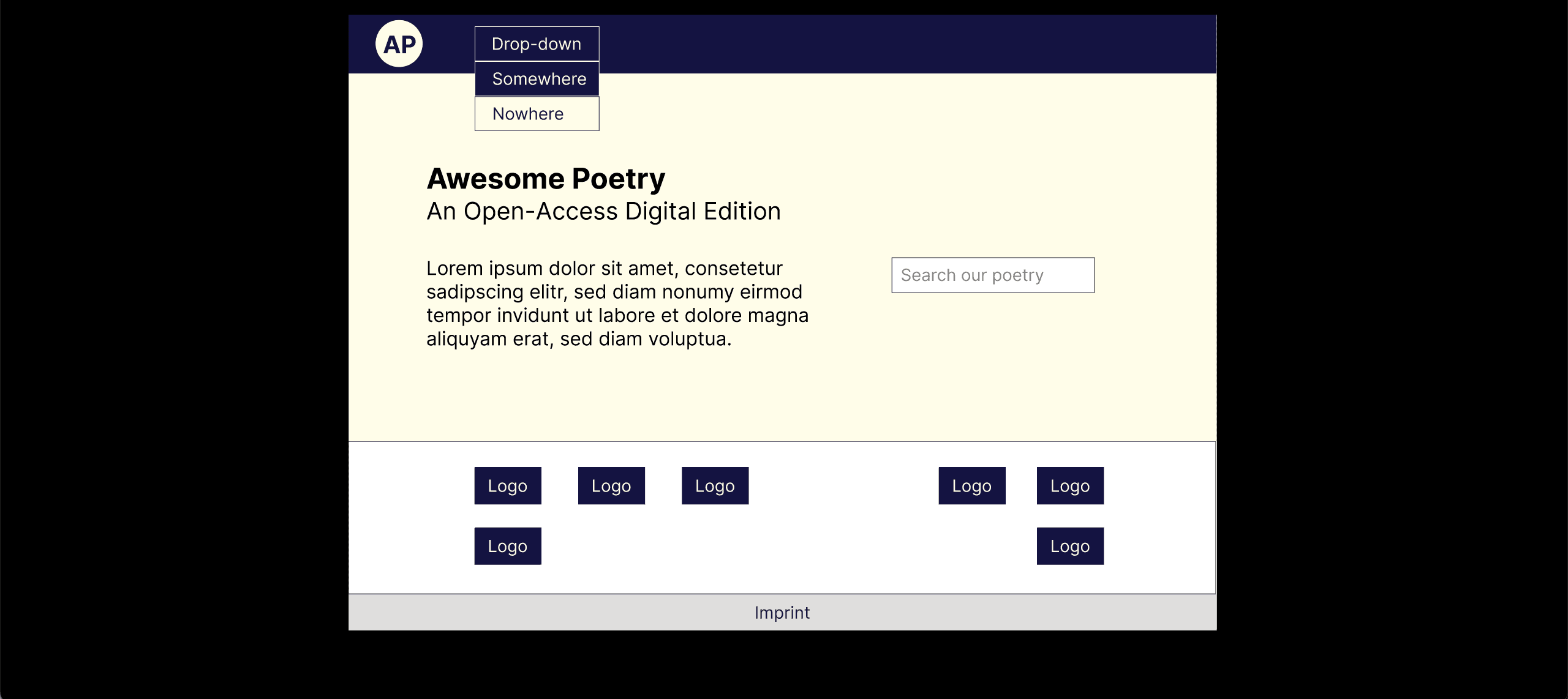
Figure 18: Previewing your prototype.
Outlook
At this point, it may have become easy to see how a UI prototype can be further enriched by including more components whose variants, and the interrelations created between them, can add to realistically simulating website functionalities. It needs to be noted that there are many more functions than those introduced above, such as using the Constraints function to make your pages responsive, exporting CSS code from Figma, or Figma’s build-in version control.
There is much community-driven support (both text and video) online that will help you to explore the full potentials of Figma and solve specific problems that you encounter. Figma’s Community Forum might be a good starting point for getting in touch with the user community. You will also find a large number of public plugins for standard functionalities (including dropdown menus).
Find the Figma design file worked on in the example above here.
Acknowledgements
Parts of this introduction are based on contents provided by Fabian Etling (CeDiS, Freie Universität Berlin) at ide 2022 Winter School Digitale Editionen - Interface-Design, University of Wuppertal, 21-25 Mar 2022, see also Fabian’s contribution published to the Figma Community.